Introduction: As COVID-19 is the on going event and lots of data is being pubished by different sources about it. A lot of information published is published by government organisations and research groups which consists of many technical terms which is difficult for the common public to comprehend. Also, many sources which publishes the data does not provide consistency in reporting COVID information, hence an effort is made by using Jons Hopkins dataset (one of the consistent dataset) to make visualizations which can be eaily interpreted by the common public. By these visualization efforts are made to make general public understand the evolution of COVID-19 in their country. For this project John Hopkins COVID Dataset is used.
Dataset Discription: For this project information related to total death, total cases, new deaths and cases has been used. In the dataset all these data was presented in the form of time series fashion. Hence the data is very good to study the progression of the pandemic with respect to time and country. Data starts from 1st Jan, 2020 and from then it has been continouously updated for each country every day. As the data starts from very begining of the pandemic some countries which were not impacted in the begining has zero cases early on hence for many plots the graph starts with a straight line which continue for few days.
Plot Used:
For this part of the project I have selected 3 plots:
* The world map is an interactive plot, one can hover mouse pointer to see the total case count and the country name. This plot also shows the total number of COVID cases with the help of the color bar. The world map shows global propspective of the pandemic,and user can compare the situation across different countries.
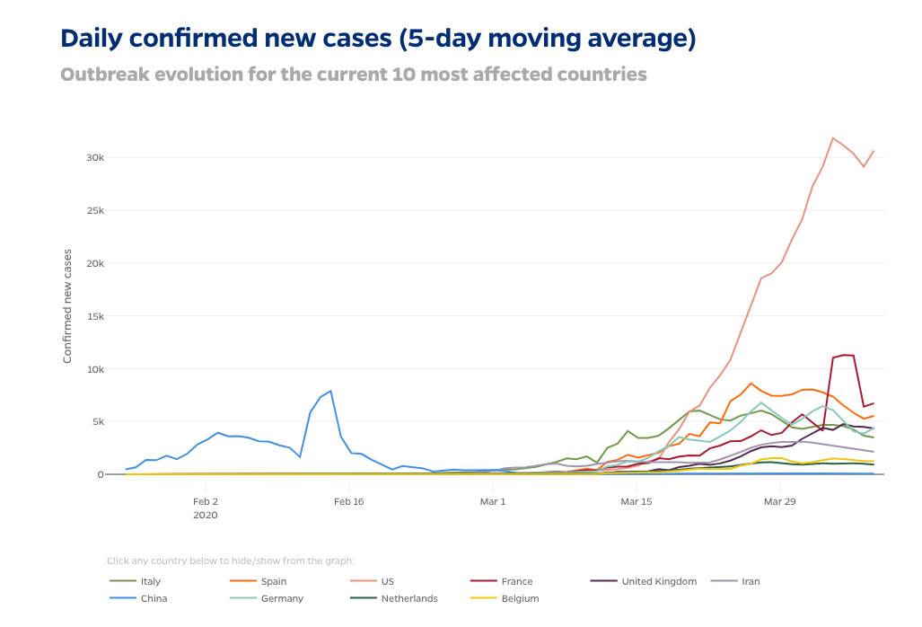
* Second plot(Line Plot) shows the trends with 5 days moving average of the most affected countries by the month of April. This type of plot helps in understanding the trend across various countries and future predictions can be made by looking at this plots.
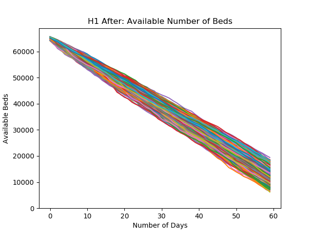
* Lastly plot is a output of a monte-carlo simulation where given values (from trends) shows us the specific day at which hospitals across USA will not be able to handle inflow of new patients(or overflow). The rate of increase in COVID cases was taken from the initial phase of the disease and according to which at that rapid rate of spread it would take almost 45 to 50 days for health system to get overwhelmed.
These plots can be very helpful in understanding the impact of the pandemic for different countries and relate them to a glabal prospective. The second plot is a line plot, and can be helpful in understanding the evolution of the disease in top most impacted countries. One can understand from the world map that the USA has highest count of COVID-19 patients till 12th November, 2020 and this plot can be related to the line plot as the USA has the steepest curve of growth which signifies that till April 2020 has the growth which continued furhter to make the United States topping the charts.In addtion, the world map shows that in November India and Brazil are second and third most impacted countries, but these countries are nor in top 10 till April which means these countries had surge in cases after the COVID cases after April and had grown quit fast to take their respective positions.
There is a strong correlation between the first and second plot as the case count of the USA has increased exponentially and also when comparing the case count for other countries like Italy, Spain and UK it is evident that trends from the line graph matches with that from world map's. Also, the rate of decline in US hospital maps is also significant as the line plot shows sudden rise in the COVID cases in America. Finally talking about the third plot. This plot uses statistical figures from the COVID propagation in USA, to find out the number of days it will take to fill all the hospital beds in the region. This information can be gathered from the line plot above, and can be implemented to other countries to display the days to overwhelme the health system of that country.
Conclusion:
As the COVID-19 cases will rise the line plot will show steaper upwards trends and plot from simulation will show steaper
downwards slop. Due to this the total number displayed on the world map will raise and will keep on rising till the it ends(if map shows live updates)
but the line plot's values are dependent on the rate of infection for new cases. In addition to this, we can observe from the world map that the countries which
are most affected from the pandemic are USA, Brazil, and India, also the countries in Europe and South America are also have large number of the COVID-19 cases.
In addition from the map we can see that their large difference in the total cases when we compare USA, with European countries, this thing is also communicated by
our second plot which shows as of March 2020, the rate of infection in USA is much higher than other countries included. Talking about the least impacted or
countries which controlled the COVID-19 are countries from Africa and Australia with some degree of excceptions.
References:
Johns Hopkins adds new data visualization tools alongside COVID-19 tracking map. (2020, April 9). HUB. https://hub.jhu.edu/2020/04/09/data-visualization-covid19-map/
One World in Data. (2020, January 1–May 12). Coronavirus Source Data [Dataset]. https://ourworldindata.org/coronavirus-source-data
Source of plot 3 : https://github.com/rohits4/Monte-Carlo-Simulation-of-Hospital-Capacity-During-COVID-19